


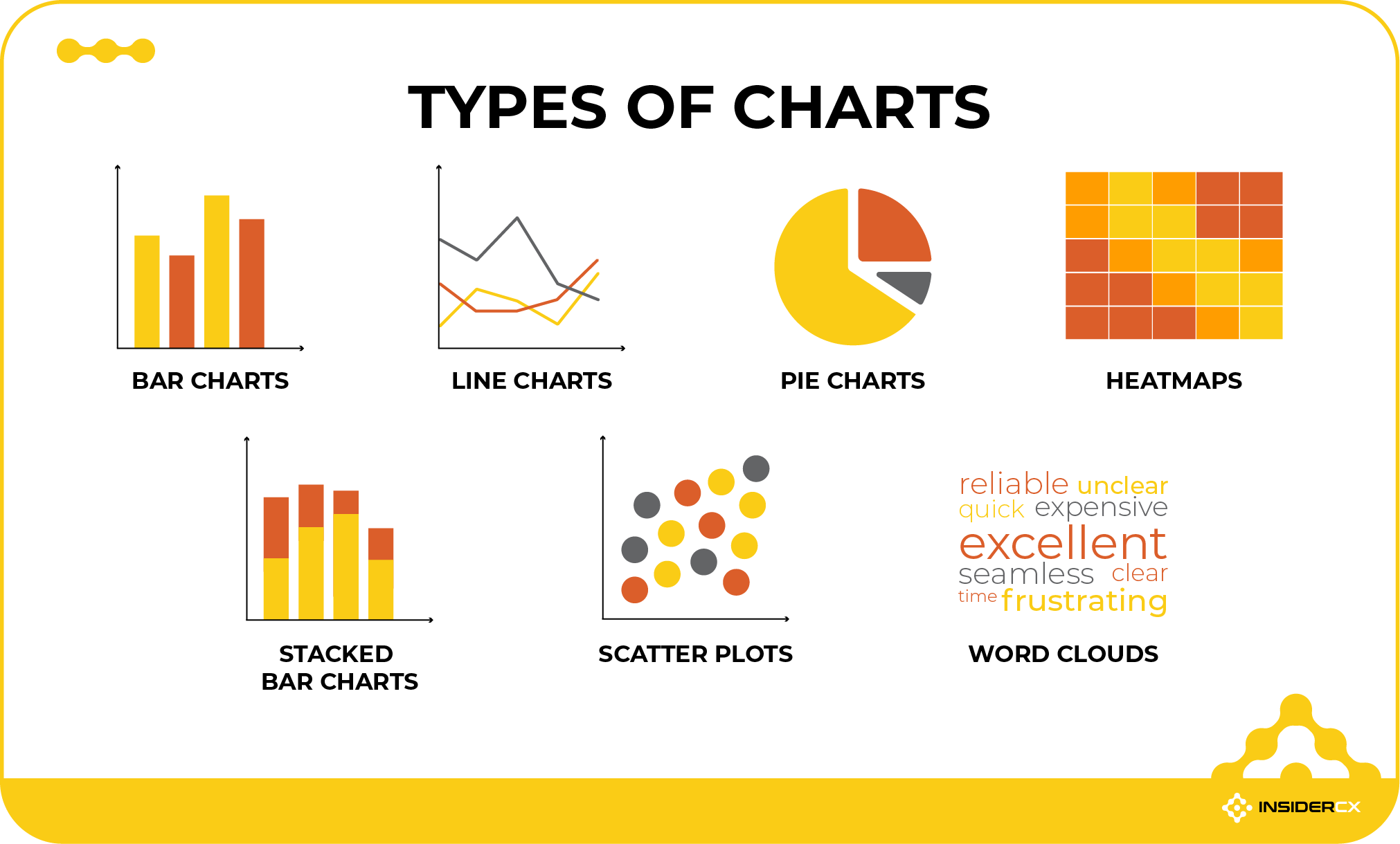
Types of Charts Data is everywhere. From business reports and marketing dashboards to school projects and scientific research, information is often easier to understand when it is presented visually. This is where types of charts come into play. Charts transform complex numbers and datasets into visual representations that help people identify trends, patterns, and relationships more quickly.
The right chart can make information clear and engaging, while the wrong chart can create confusion. Understanding the different types of charts and their purposes is essential for anyone who works with data. Whether you are a student, business professional, marketer, or researcher, knowing which chart to use can significantly improve your communication.
In this guide, we will explore the most common types of charts, their advantages, and the situations where they work best.
Why types of charts Are Important
Charts help simplify large amounts of information. Instead of reading through rows of numbers in a spreadsheet, people can quickly understand data through visual elements such as bars, lines, and slices. This makes types of chartsvaluable for presentations, reports, and decision-making processes.
Visual representation also improves memory retention. Studies have shown that people often remember images and visual information better than plain text. A well-designed chart can communicate a message much faster than a lengthy explanation.
Another important benefit is comparison.types of charts make it easier to compare categories, track changes over time, and identify trends. They allow viewers to draw conclusions quickly without having to perform calculations themselves.
Bar Charts
Bar charts are among the most widely used chart types. They display data using rectangular bars, where the length or height of each bar represents a value. These charts are excellent for comparing different categories.
Businesses frequently use bar charts to compare sales performance, customer demographics, product popularity, and other measurable factors. Because the visual differences between bars are easy to see, viewers can quickly identify the highest and lowest values.
Bar charts can be displayed vertically or horizontally. Vertical bar types of charts are often used when category names are short, while horizontal bar charts work well when labels are longer. Their simplicity makes them one of the most effective chart options for presenting categorical data.
Line types of charts
Line types of charts are designed to show changes over time. Data points are connected by lines, allowing viewers to see trends and patterns across a period.
These types of charts are commonly used in finance, economics, marketing, and science. For example, a company might use a line chart to display monthly sales growth, while a scientist may use one to track temperature changes over several years.
One of the biggest advantages of line types of charts is their ability to highlight trends. They clearly show whether values are increasing, decreasing, or remaining stable. When multiple lines are included, they can also compare different datasets within the same chart.
Pie types of charts
Pie charts represent data as portions of a circle. Each slice of the pie corresponds to a percentage or proportion of the whole. This chart type is useful when you want to show how individual parts contribute to a total.
Businesses often use pie charts to illustrate market share, budget allocation, or survey results. For instance, a pie chart can show how a company’s expenses are divided among different departments.
Although pie charts are visually appealing, they work best when there are only a few categories. Too many slices can make the chart difficult to read and interpret accurately. Therefore, pie charts should be reserved for simple part-to-whole comparisons.
Scatter Charts
Scatter charts, also known as scatter plots, display individual data points on a graph. Each point represents two variables, one plotted on the horizontal axis and the other on the vertical axis.
These charts are commonly used in statistics and research to identify relationships between variables. For example, a business might analyze the connection between advertising spending and sales revenue using a scatter plot.
Scatter charts are particularly useful for detecting correlations, clusters, and outliers. They help analysts determine whether two variables have a positive relationship, a negative relationship, or no significant relationship at all.
Area Charts
Area charts are similar to line charts, but the space beneath the line is filled with color. This visual enhancement makes it easier to understand the magnitude of values over time.
Organizations often use area charts to display cumulative totals and overall trends. They can effectively show how different categories contribute to a total across a period.
One advantage of area charts is that they provide both trend information and volume representation. However, when multiple datasets overlap, readability can become challenging. Careful design is necessary to ensure clarity.
Histogram Charts
A histogram resembles a bar chart but serves a different purpose. Instead of comparing categories, histograms show the distribution of numerical data across intervals or ranges.
For example, a teacher might use a histogram to display the distribution of exam scores among students. This helps identify whether scores are concentrated in certain ranges or spread evenly across the dataset.
Histograms are widely used in statistics because they reveal patterns such as skewness, normal distribution, and data concentration. They are valuable tools for understanding how data is distributed.
Bubble Charts
Bubble charts are an advanced form of scatter chart. In addition to the horizontal and vertical axes, they use the size of bubbles to represent a third variable.
This allows users to visualize three dimensions of data within a single chart. For example, a company could compare sales revenue, profit margin, and market size simultaneously.
Bubble charts are particularly useful when dealing with complex datasets. However, they require careful interpretation because large bubbles can sometimes dominate the visual space and influence perception.
Radar Charts
Radar charts, sometimes called spider charts, display multiple variables on a circular grid. Each axis extends outward from the center, representing a different category or metric.
These charts are commonly used for performance evaluations. For example, a business might compare employee skills, while a sports analyst could evaluate athletes across multiple performance indicators.
Radar charts make it easy to compare strengths and weaknesses across several categories. However, they can become difficult to read when too many variables or datasets are included.
Waterfall Charts
Waterfall charts illustrate how an initial value changes through a series of positive and negative contributions. They are often used in financial reporting and business analysis.
For example, a company may use a waterfall chart to explain how revenue, expenses, taxes, and other factors affect final profit. Each step shows how the value increases or decreases along the way.
These charts are highly effective for demonstrating sequential changes and helping audiences understand how individual components contribute to a final result.
Combination Charts
Combination charts merge two or more chart types into a single visualization. The most common example combines bars and lines within the same chart.
Businesses often use combination charts when comparing different metrics that are related but measured differently. For instance, sales figures may be displayed as bars while profit margins are shown as a line.
This chart type provides a comprehensive view of data and allows multiple perspectives to be presented simultaneously. However, it requires thoughtful design to avoid overwhelming the audience.
Choosing the Right Chart
Selecting the right chart depends on your data and communication goals. If you need to compare categories, bar charts are usually the best option. If you want to show trends over time, line charts are often more effective.
When illustrating proportions, pie charts can be useful, while scatter plots work best for exploring relationships between variables. Histograms help analyze distributions, and radar charts support multi-factor comparisons.
Before creating a chart, consider your audience. The goal should always be to make information easy to understand. Simplicity and clarity are often more important than visual complexity.
Common Mistakes to Avoid
One common mistake is choosing a chart type that does not match the data. For example, using a pie chart with too many categories can make interpretation difficult.
Another issue is excessive decoration. Bright colors, unnecessary labels, and complex designs can distract viewers from the actual message. Effective charts prioritize readability over aesthetics.
It is also important to avoid misleading scales and distorted proportions. Manipulating chart axes can exaggerate trends and create inaccurate impressions. Honest visualization is essential for maintaining credibility.
Conclusion
Understanding the different types of charts is an essential skill in today’s data-driven world. Charts help transform raw numbers into meaningful insights, making information easier to understand and communicate. From simple bar charts and line graphs to advanced scatter plots and waterfall charts, each chart type serves a unique purpose.
The key to successful data visualization is choosing the chart that best matches your objective. When used correctly, charts can reveal trends, highlight relationships, and support informed decision-making. Whether you are preparing a business report, conducting research, or presenting information to an audience, mastering the various types of charts will help you communicate data with confidence and clarity.