


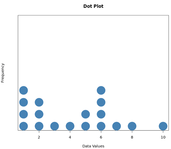
What Is a Dot Plot?
A dot plot is a simple graphical representation used to display data points on a number line. Each value in a dataset is represented by a dot, making it easy to visualize the distribution of data. are commonly used in mathematics, statistics, education, and data analysis because they provide a clear picture of how values are spread across a range.
Unlike complex charts and graphs, dot plots are easy to create and understand. They are especially useful when working with small to medium-sized datasets. By looking at a you can quickly identify patterns, clusters, gaps, and unusual values within the data.
The simplicity of a dot plot makes it an excellent tool for students learning statistics and for professionals who need a quick way to analyze numerical information. Whether you’re examining test scores, survey results, or measurement data, a dot plot offers an efficient way to visualize information.
The History and Purpose of Dot Plots
Dot plots have been used in statistics for many years as a straightforward method for displaying numerical data. Before advanced computer-generated visualizations became common, statisticians relied on simple graphical tools like dot plots to analyze data distributions.
The primary purpose of a dot plot is to show individual data values rather than grouping them into categories. This allows viewers to see every observation in the dataset. As a result, dot plots provide a level of detail that some other graphs, such as histograms, may hide.
Another important purpose of dot plots is to help identify trends and patterns. Researchers and analysts can quickly spot concentrations of values, detect outliers, and evaluate the overall shape of a dataset. This makes valuable in both educational and professional settings.
How a Dot Plot Works
A dot plot uses a horizontal number line that contains the range of values in the dataset. Each occurrence of a value is represented by a single dot placed directly above that value on the number line. If a value appears multiple times, the dots are stacked vertically.
For example, imagine a class test where students scored 70, 75, 75, 80, 85, 85, and 85. In a, one dot would be placed above 70, two dots above 75, one dot above 80, and three dots above 85. This immediately shows which scores occurred most frequently.
The stacking of dots makes frequency easy to identify without needing complicated calculations. As more dots appear above a specific value, it becomes clear that the value occurs more often in the dataset. This visual simplicity is one of the biggest advantages of dot plots.
Creating a Dot Plot Step by Step
Creating a is relatively easy and requires only a few basic steps. First, gather and organize the data you want to display. Ensure that all values are listed clearly so you can determine the range of the dataset.
Next, draw a horizontal number line that includes all values in the dataset. The scale should be evenly spaced and easy to read. Mark the minimum and maximum values so that the entire dataset can fit comfortably on the graph.
Finally, place a dot above each value on the number line. If multiple observations share the same value, stack the dots vertically. Once all data points have been plotted, review the graph to ensure accuracy. The finished dot plot will provide a visual summary of the dataset.
Advantages of Using Dot Plots
One of the biggest advantages of dot plots is their simplicity. They are easy to understand even for individuals with limited statistical knowledge. Because every data point is visible, viewers can gain a complete understanding of the dataset without losing important details.
Another major benefit is the ability to identify patterns quickly. Clusters of dots may indicate common values, while gaps may reveal missing ranges in the data. Outliers are also easy to spot because they appear isolated from the rest of the observations.
Dot plots are also highly effective for comparing small datasets. Teachers, researchers, and analysts often use them to illustrate distributions, frequencies, and trends without overwhelming audiences with complex visualizations. Their clarity makes them ideal for presentations and educational purposes.
Dot Plot vs. Histogram
Many people confuse with histograms because both are used to display numerical data. However, there are important differences between the two visualization methods.
A dot plot shows individual data points, allowing viewers to see every observation in the dataset. This level of detail makes it easier to identify exact values and frequencies. Histograms, on the other hand, group data into intervals or bins, which can hide individual observations.
For smaller datasets, are often the better choice because they provide more detailed information. Histograms become more useful when dealing with very large datasets, where displaying individual values would be impractical. Understanding the strengths of each graph helps analysts choose the most appropriate visualization method.
Common Applications of Dot Plots
Dot plots are used in a wide variety of fields. In education, teachers use them to help students understand data distribution, frequency, and statistical concepts. Their visual nature makes learning easier and more engaging.
In business environments, dot plots can be used to analyze customer feedback scores, sales figures, production measurements, and performance metrics. Managers often rely on simple visualizations like dot plots to make quick decisions based on available data.
Scientists and researchers also use dot plots when examining experimental results. By displaying individual observations, they can identify trends, compare samples, and detect unusual outcomes. This makes dot plots valuable tools in scientific analysis and research reporting.
Understanding Data Distribution Through Dot Plots
One of the most valuable aspects of a is its ability to reveal data distribution. Distribution refers to how data values are spread across a range. A dot plot makes this easy to see at a glance.
When dots cluster around a central value, the dataset may have a normal or balanced distribution. If dots are concentrated on one side of the graph, the distribution may be skewed. These patterns help analysts understand the underlying characteristics of the data.
Dot plots also make it easy to identify variability. A dataset with dots spread across a wide range indicates greater variation, while a tightly clustered dataset suggests consistency. Understanding distribution is essential for accurate statistical analysis and decision-making.
Limitations of Dot Plots
Despite their usefulness, dot plots do have some limitations. One challenge is that they become less effective when dealing with very large datasets. Hundreds or thousands of data points can make the graph crowded and difficult to interpret.
Another limitation is that dot plots are best suited for numerical data. While they can display frequencies effectively, they are not ideal for complex categorical information. Other chart types may provide better insights when working with non-numerical data.
Additionally, dot plots may require more space when many values occur frequently. Stacked dots can become tall and difficult to read. In such cases, alternative visualizations such as histograms or box plots may be more practical.
Why Dot Plots Remain Important Today
Even in an era of advanced data visualization software,continue to play an important role. Their simplicity and transparency make them valuable tools for teaching, learning, and analyzing data. Users can understand a within seconds, which is not always true for more sophisticated charts.
Modern statistical software and spreadsheet applications often include built-in tools for creating . This accessibility has helped maintain their popularity among educators, researchers, and business professionals alike.
As organizations increasingly rely on data-driven decision-making, the ability to communicate information clearly becomes more important than ever. remain one of the most effective ways to present numerical data in a straightforward and meaningful manner.
Conclusion
are powerful yet simple tools for visualizing numerical data. By displaying individual observations on a number line, they provide clear insights into frequency, distribution, patterns, and outliers. Their ease of use makes them suitable for students, educators, researchers, and business professionals alike.
Although they may not be ideal for extremely large datasets, excel when working with smaller collections of data where individual values matter. They offer a level of detail that helps users better understand the information being presented.
Whether you are learning statistics, conducting research, or analyzing business performance, understanding how to create and interpret a can significantly improve your ability to work with data. Their enduring popularity proves that sometimes the simplest visualization tools are also the most effective.