


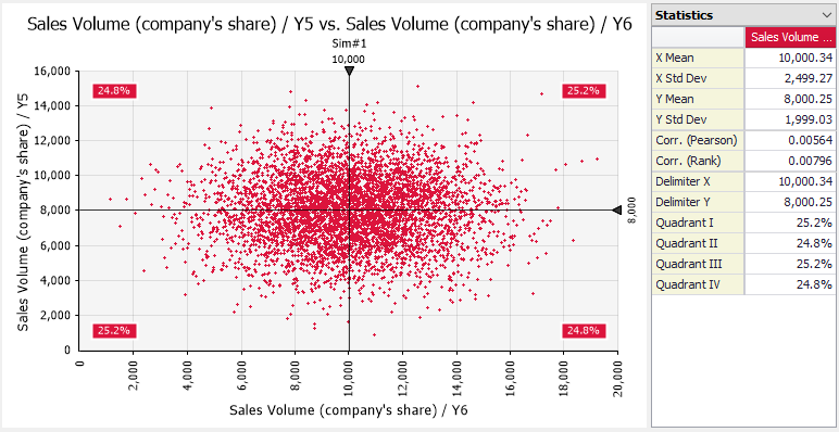
Scatter Plot Data visualization plays a crucial role in modern analytics, research, business intelligence, and decision-making. Among the many visualization tools available, the scatter plot stands out as one of the simplest yet most powerful methods for identifying relationships between variables. Whether you are a student learning statistics, a researcher analyzing trends, or a business professional evaluating performance metrics, understanding can help you make sense of complex datasets.
A scatter plot provides a visual representation of data points on a graph, allowing users to observe patterns, trends, and correlations. By plotting values along horizontal and vertical axes, it becomes easier to identify whether variables are related and how strongly they influence one another.
In this article, we will explore what a is, how it works, its benefits, practical applications, and best practices for creating effective scatter plots.
What Is a Scatter Plot?
A scatter plot is a graphical representation that displays individual data points on a two-dimensional coordinate system. Each point on the graph represents a pair of values, typically one value on the x-axis and another on the y-axis. The position of each point reveals the relationship between the two variables being analyzed.
The primary purpose of a is to identify correlations between variables. For example, a business might use a scatter plot to examine the relationship between advertising spending and sales revenue. If sales increase as advertising spending increases, the can visually demonstrate this connection.
Scatter plots are commonly used in statistics, data science, economics, healthcare, engineering, and social sciences. Their simplicity makes them easy to understand, while their ability to reveal meaningful insights makes them invaluable for data analysis.
How a Scatter Plot Works
A scatter plot operates by assigning one variable to the horizontal axis (x-axis) and another variable to the vertical axis (y-axis). Every observation in the dataset becomes a point on the graph. The placement of these points helps reveal whether a relationship exists between the variables.
For example, imagine collecting data on students’ study hours and exam scores. Study hours could be placed on the x-axis, while exam scores appear on the y-axis. Each student’s data would form a single point on the graph. As more points are added, patterns begin to emerge.
If the points trend upward from left to right, this may indicate a positive relationship. If they trend downward, it may suggest a negative relationship. If the points appear randomly scattered without a clear pattern, there may be little or no relationship between the variables.
Types of Relationships Revealed by Scatter Plots
One of the greatest strengths of scatter plots is their ability to visualize different types of relationships. Understanding these relationships helps analysts draw meaningful conclusions from data.
A positive correlation occurs when both variables move in the same direction. For instance, as exercise frequency increases, overall fitness levels may improve. In a scatter plot, the points generally rise from left to right, indicating a positive trend.
A negative correlation occurs when one variable increases while the other decreases. For example, increased screen time might correlate with reduced sleep duration. In this case, the points typically slope downward from left to right.
Sometimes, no correlation exists between variables. In such situations, the points appear randomly distributed throughout the graph, showing no clear pattern. This indicates that changes in one variable do not consistently affect the other.
Advantages of Using Scatter Plots
Scatter plots offer numerous advantages that make them a preferred visualization tool for analysts and researchers. One major benefit is their simplicity. Even individuals with limited statistical knowledge can often interpret a effectively.
Another advantage is the ability to detect trends quickly. Instead of reviewing lengthy tables of numbers, users can immediately identify relationships through visual inspection. This can save significant time when analyzing large datasets.
Scatter plots are also excellent for identifying outliers. Outliers are data points that differ significantly from the rest of the dataset. Detecting these unusual values can help researchers identify errors, anomalies, or unique observations that require further investigation.
Real-World Applications of Scatter Plots
Scatter plots are used across countless industries and disciplines. In business, they help organizations understand customer behavior, sales performance, and marketing effectiveness. Companies often use scatter plots to evaluate relationships between advertising budgets and revenue growth.
In healthcare, scatter plots assist researchers in studying connections between lifestyle habits and health outcomes. For example, scientists may examine the relationship between physical activity levels and blood pressure readings to identify trends.
Education professionals also benefit from scatter plots. Schools and universities can analyze factors such as attendance rates and academic performance. By visualizing these relationships, educators can make informed decisions about interventions and student support programs.
How to Create an Effective Scatter Plot
Creating an effective requires careful planning and attention to detail. The first step is selecting two numerical variables that you want to compare. The variables should have a logical connection to ensure meaningful analysis.
Next, assign one variable to the x-axis and the other to the y-axis. Label both axes clearly so viewers can understand the data being presented. Accurate labeling improves readability and prevents confusion.
After plotting the data points, review the graph for patterns, clusters, or unusual observations. In many cases, adding a trend line can further enhance interpretation by highlighting the overall direction of the relationship between variables.
Example of a Scatter Plot
The example below shows a simple scatter plot demonstrating the relationship between study hours and exam scores.
In this example, the points move upward as study hours increase. This pattern suggests a positive correlation between studying and exam performance. While real-world datasets are often more complex, this simple example illustrates the core purpose of a scatter plot.
Analysts frequently use similar visualizations to explore relationships before conducting deeper statistical analysis. The visual pattern provides an initial understanding of the data and helps guide further investigation.
By examining the arrangement of points, users can quickly determine whether additional analysis is warranted and what type of relationship may exist.
Common Mistakes to Avoid
One common mistake when creating is using variables that are unrelated. Comparing unrelated data may produce misleading visualizations and incorrect conclusions. Always ensure there is a logical reason for comparing the selected variables.
Another mistake is overcrowding the graph with excessive data points. When too many points overlap, patterns become difficult to identify. In such cases, techniques like transparency or data sampling can improve readability.
Poor labeling is another frequent issue. Missing axis labels, unclear titles, or inconsistent scales can confuse viewers and reduce the effectiveness of the visualization. Proper labeling is essential for accurate interpretation.
Scatter Plot vs Other Charts
Scatter plots differ from bar charts, line charts, and pie charts in several important ways. While bar charts compare categories and line charts emphasize trends over time, scatter plots focus on relationships between numerical variables.
Unlike pie charts, which display proportions, reveal correlations and distributions. This makes them particularly useful when exploring potential cause-and-effect relationships or identifying patterns within data.
Choosing the right chart depends on the analysis objective. If the goal is to understand how two variables interact, a is often the most appropriate choice. Its ability to reveal hidden relationships makes it one of the most valuable tools in data visualization.
Conclusion
Scatter plots are among the most effective tools for visualizing relationships between variables. Their simple design allows users to identify correlations, trends, clusters, and outliers quickly and efficiently. From business analytics and scientific research to education and healthcare, scatter plots provide valuable insights that support better decision-making.
By understanding how scatter plots work and following best practices when creating them, analysts can transform raw data into meaningful visual stories. Whether you are analyzing sales figures, studying scientific data, or exploring academic performance, a well-designed scatter plot can reveal patterns that might otherwise remain hidden.
As data continues to drive decision-making across industries, mastering the use of scatter plots is a valuable skill that can improve analytical thinking and enhance data interpretation. Their versatility, simplicity, and effectiveness ensure they will remain a fundamental tool in data visualization for years to come.